
Direct Mail Design Best Practices That Drive Response

Direct mail design best practices are the set of visual, messaging, and data-driven rules that determine whether a mail piece gets read or recycled. Campaigns built on these principles consistently outperform generic mailers. Personalized campaigns using variable data printing generate 2 to 3 times the response rate of static mail. That number alone justifies treating design as a strategic function, not a finishing step. This guide walks marketing professionals and graphic designers through every layer of effective direct mail execution, from layout fundamentals to proofing protocols.
What are the core elements of effective direct mail design?
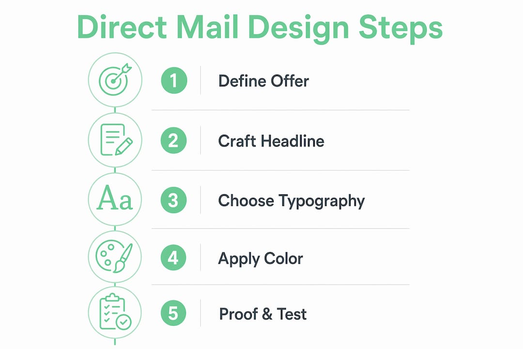
Strong direct mail design starts with a single, focused offer. Every element on the piece should support that one offer. The moment you add a second offer, you split attention and reduce response.
The headline is the most critical real estate on any mail piece. It must communicate a clear benefit in under two seconds. Offer-focused headlines above the fold consistently outperform branding-focused designs. The logo brands the piece. The offer sells it.

A single compelling image outperforms multiple images every time because it gives the reader one clear focal point tied directly to the headline. Multiple images compete for attention and dilute the message.
Here are the non-negotiable design elements every direct mail piece needs:
- Benefit-led headline visible within two seconds of picking up the piece
- One supporting image that reinforces the headline, not decorates the page
- Clear typography hierarchy using size and weight to guide the eye
- White space to reduce visual overload and let key messages breathe
- A dominant call to action (CTA) placed where the eye naturally lands
- Trackable response mechanisms such as PURLs, QR codes, or unique phone numbers
- USPS-compliant specs including proper address block placement and barcode clearance zones
For standard 5.5×8.5 postcards, USPS requires 8–12 pt font on the address side for barcode readability. Violating that spec can delay or kill delivery entirely.
Pro Tip: Before sending your design to print, cover the logo and ask someone unfamiliar with the campaign what the piece is offering. If they cannot answer in five seconds, the headline needs work.
How can personalization and segmentation elevate direct mail effectiveness?
Personalization in direct mail operates on a spectrum. At the basic end, you insert a recipient’s first name. At the advanced end, variable data printing (VDP) swaps out headlines, images, offers, and callouts based on individual data records. The industry term for this advanced approach is one-to-one direct mail, and it is where the real response gains live.
Segmentation-based personalization achieves a 50%–100% lift in response rates versus static mail. That lift compounds when you combine accurate segmentation with relevant creative variations.
The risk most marketers underestimate is data quality. Using low-confidence or guessed data harms trust and response rates worse than sending a generic piece. A piece addressed to “Dear FNAME” or featuring an irrelevant offer based on stale data signals carelessness to the recipient.
Follow these steps to execute personalization correctly:
- Audit your data first. Identify which fields are complete, accurate, and recent before building any variable logic.
- Segment by behavior or demographics. Group recipients by purchase history, geography, or lifecycle stage, not just name.
- Define your variable elements. Decide which creative components will change: headline, image, offer, or all three.
- Run NCOA processing. NCOA address validation achieves roughly 94% match accuracy, which directly protects your deliverability and ROI.
- Proof variable records before printing. Pull 5–10 random records as PDFs and review each one for merge errors.
Variable data printing is most cost-effective for campaigns between 500 and 25,000 pieces. Below 500, the setup cost per piece climbs steeply. Above 25,000, offset printing economics often shift the math.
Pro Tip: Build a “worst case” proof record with the longest possible name, the shortest offer text, and an edge-case image to confirm your layout holds across all data variations, not just the clean ones.
For a deeper look at how verified personalization builds engagement, the Envypak guide on personalized direct mail covers the mechanics in detail.
Typography, layout, and color: what actually drives readability?
Visual hierarchy is the most critical factor in direct mail design. Size, color, and placement guide the reader’s eye from headline to offer to CTA. When those three elements compete rather than cooperate, the reader disengages within seconds.
Typography size hierarchy
| Element | Recommended Size | Purpose |
|---|---|---|
| Headline | 36–60 pt | Immediate attention and offer clarity |
| Subheadline | 18–24 pt | Supporting context or secondary benefit |
| Body copy | 10–12 pt | Detail, proof points, and terms |
| Contact info / CTA | 18–24 pt | Response prompt and next step |
These typography size guidelines are not arbitrary. They reflect how quickly the human eye processes a printed piece at arm’s length.
Color and contrast rules
Color choices in direct mail serve one function: directing attention. High-contrast color combinations between background and text improve readability at a glance. For CTAs, red, orange, and dark blue consistently outperform neutral tones because they signal urgency or authority without blending into the layout.
Avoid using more than two accent colors on a single piece. Each additional color competes for attention and dilutes the emphasis on your CTA. Full-bleed background designs work well for premium or lifestyle brands. White space designs work better for offers that need to feel urgent and clear.
- Use white space as visual breathing room that eases cognitive processing
- Keep logo size proportional to the offer, not the other way around
- Never use a decorative font for body copy; stick to clean serif or sans-serif faces
- Align CTA buttons or response boxes to the natural reading path, which runs top-left to bottom-right for most Western audiences
The most common layout mistake is letting the logo dominate the front panel. The logo confirms who sent the piece. The offer is what makes the recipient act.
How to proof, test, and optimize direct mail designs before submission
Proofing is where campaigns are saved or lost. Screen proofs look clean. Printed proofs reveal the truth about color accuracy, trim alignment, and text legibility at actual size.
Here is the proofing sequence every campaign needs before going to press:
- Request a physical press proof. Physical printed proofs with multiple variable outputs reveal color shifts, contrast issues, and trim problems that screen proofs consistently miss.
- Run the 3-second test. Hand the printed piece to someone unfamiliar with the campaign. The 3-second test confirms whether a stranger can identify the core offer immediately. If they cannot, the design fails.
- Sample your variable data. Pull 5–10 random records as PDFs and review each one. Preflight variable data proofing catches “Dear FNAME” errors and broken image logic before the full print run.
- Test all trackable elements. Scan every QR code. Visit every PURL. Dial every unique phone number. Broken tracking kills your ability to measure results.
- Validate your mailing list. Run NCOA processing and remove duplicates, undeliverables, and suppression list matches before submitting to the mail house.
“The 3-second test is the simplest and most reliable design validation method in direct mail. If a stranger cannot identify your offer in three seconds, your design is not working.” — DirectMail.io
Pro Tip: Print your proof at 100% scale and hold it at arm’s length. Most recipients handle mail standing up, not sitting at a desk. What reads clearly on screen may become illegible at that distance.
Your direct mail campaign checklist: from brief to mailbox
A complete direct mail campaign checklist keeps design, data, and logistics aligned across every stage. Use this before every send.
Planning and strategy:
- Define the single campaign goal and primary offer
- Identify and segment your audience using behavioral or demographic data
- Select the right mail format: postcards, self mailers, or envelopes based on offer complexity
Design and copy:
- Write a benefit-led headline that communicates the offer in one line
- Choose one primary image that supports the headline
- Apply correct typography hierarchy per USPS specs
- Place the CTA prominently with high-contrast color
- Include a trackable response mechanism: QR code, PURL, or unique phone number
Personalization and data:
- Audit data fields for completeness and accuracy
- Run NCOA processing to validate addresses
- Build and proof variable data logic with sample records
Proofing and production:
- Request a physical press proof
- Conduct the 3-second test with a fresh set of eyes
- Confirm all trackable elements are live and functional
- Review USPS compliance for size, weight, and address block specs
Post-send measurement:
- Track response by channel: QR scans, PURL visits, phone calls
- Compare results against baseline or prior campaign benchmarks
- Document what worked for the next iteration
Pairing strong design with the right packaging format matters as much as the creative itself. Envypak’s guide on envelope design best practices covers how the outer package affects open rates before a recipient ever sees your design.
Why most direct mail fails before it reaches the offer
After reviewing hundreds of direct mail campaigns, the pattern is clear. The pieces that fail are not failing because of bad offers. They fail because the design buries the offer under brand identity, decorative imagery, or competing messages.
The most persistent client misconception I encounter is that a larger logo builds more trust. It does not. Recipients do not respond to logos. They respond to offers that feel relevant to their situation. When a brand spends 40% of the front panel on a logo and 20% on the actual offer, the math is backwards.
The second mistake is treating personalization as a cosmetic feature. Dropping a first name into a generic piece does not create relevance. Real personalization means the offer, the image, and the headline all reflect something true about that recipient’s behavior or need. That requires clean data, thoughtful segmentation, and a willingness to build multiple creative versions.
The campaigns I have seen perform best share one trait: they look simple. A clear headline, one image, one CTA, and a lot of white space. That restraint is not laziness. It is discipline. Every element that does not support the offer is a distraction, and distractions cost you response.
Integrating direct mail with digital channels, such as retargeting recipients who visit a PURL, is where the next wave of performance gains will come from. The design principles do not change. The tracking and follow-up do.
— James
How Envypak helps you put these principles into practice
Applying direct mail design best practices requires more than great creative. The physical format and packaging you choose shape how recipients engage with your piece before they read a single word.
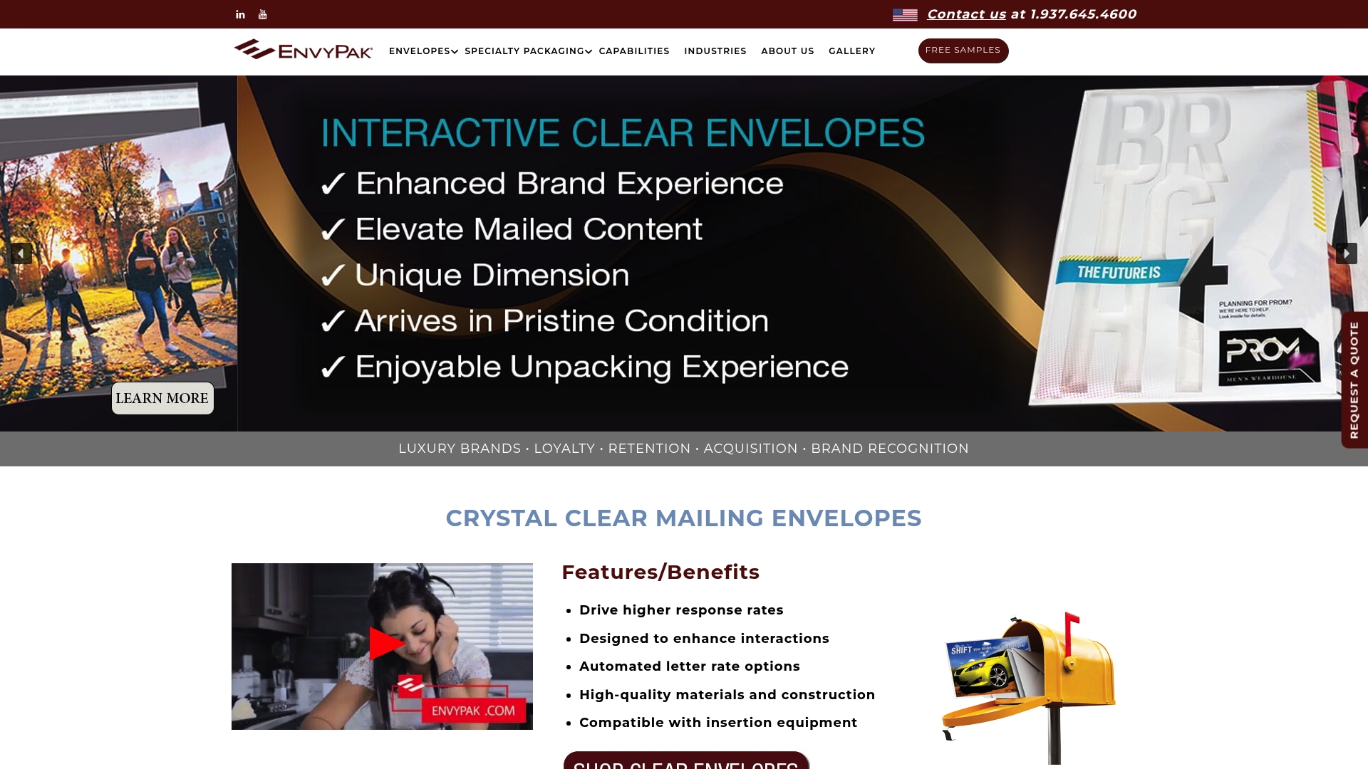
Envypak’s crystal clear mailing envelopes are built specifically for marketing campaigns that need to stand out in a crowded mailbox. The transparent design lets your creative work before the envelope is even opened, turning the outer package into part of the campaign. Envypak envelopes are automation-compatible, eco-friendly, and designed to meet USPS requirements, so your campaign moves from design to delivery without compliance surprises. Explore Envypak’s full range of custom envelopes and mailers to find the format that fits your next campaign.
Key takeaways
Effective direct mail design combines visual hierarchy, clean data, and disciplined proofing to produce measurable response lifts at every campaign scale.
| Point | Details |
|---|---|
| Offer leads, logo follows | Place the headline and offer as the dominant element; the logo confirms sender identity, not response. |
| Personalization requires clean data | Variable data printing delivers 2–3x response lifts only when built on verified, segmented audience data. |
| Typography hierarchy is non-negotiable | Use 36–60 pt headlines, 10–12 pt body copy, and 18–24 pt CTAs to guide the reader’s eye correctly. |
| Physical proofing catches what screens miss | Always request a printed press proof and run the 3-second test before approving any campaign for print. |
| Address hygiene protects ROI | NCOA processing achieves roughly 94% match accuracy, reducing undeliverable mail and wasted spend. |
FAQ
What font size does USPS require for direct mail?
USPS mandates 8–12 pt font on the address side of a mail piece for barcode readability. For the message side, industry best practice sets headlines at 36–60 pt and body copy at 10–12 pt.
How many images should a direct mail piece include?
One primary image is the standard recommendation. A single image creates a clear focal point that supports the headline, while multiple images compete for attention and reduce message clarity.
What is the 3-second test in direct mail design?
The 3-second test involves handing a printed piece to someone unfamiliar with the campaign and confirming they can identify the core offer immediately. If they cannot, the design needs revision before going to print.
When does variable data printing make financial sense?
Variable data printing is most cost-effective for campaigns between 500 and 25,000 pieces. Outside that range, setup costs or offset printing economics shift the per-piece math significantly.
What types of ctas work best in direct mail?
The most effective direct mail CTAs are single, specific, and tied to a trackable mechanism such as a QR code, PURL, or unique phone number. Red, orange, and dark blue CTA elements consistently outperform neutral colors in driving response.